Here, you batty old coot...
Woods Hole Research Center
Warming of the Earth > Scientific Evidence
Through the study of ancient ice cores from Antarctica it is possible to compare atmospheric concentrations of the
dominant greenhouse gas, carbon dioxide (CO2) in the atmosphere with temperature variations over the past 400 thousand years of the earth's history (Fig 1). A visual comparison of the two trends indicates a very tight connection between their performance, with fluctuations in one plot almost exactly mirrored in the other for more than 400 thousand years. But suddenly in the 1800s, as the Industrial Revolution takes off, atmospheric CO2 concentrations begin an unprecedented upward climb, rising rapidly from 280 ppmv (parts per million by volume) in the early 1800s to a current level of 376 ppmv, 77 ppmv above the highest concentrations previously attained in the course of the preceding 400 thousand years.
Your article blows it in the first sentence. In the first sentence they prove that they have a terribly flawed understanding of greenhouse theory, and therefore any arguement they build upon it is going to be flawed as well. You can't start from a position of misunderstanding and build a rational argument.
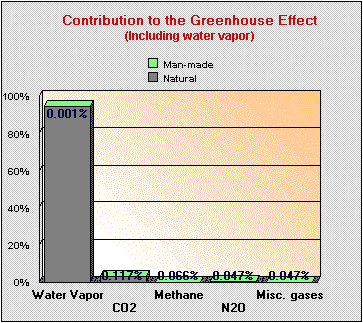
CO2 is not the dominant greenhouse gas in the atmosphere. Not even close. Here is a breakdown of the importance of greenhouse gasses in the atmosphere and the green sections show mankind's contribution.
Here is the IPCC's list of greenhouse gasses. Note that the primary greenhouse gas is not even listed.
Concentrations and their changes Radiative Forcing
Species 2005 Change since 1998 2005 (W m–2) 1998 (%)
CO2 379 ± 0.65 ppm +13 ppm 1.66 +13
CH4 1,774 ± 1.8 ppb +11 ppb 0.48 -
N2O 319 ± 0.12 ppb +5 ppb 0.16 +11
CFC-11 251 ± 0.36 ppt –13 0.063 –5
CFC-12 538 ± 0.18 ppt +4 0.17 +1
CFC-113 79 ± 0.064 ppt –4 0.024 –5
HCFC-22 169 ± 1.0 ppt +38 0.033 +29
HCFC-141b 18 ± 0.068 ppt +9 0.0025 +93
HCFC-142b 15 ± 0.13 ppt +6 0.0031 +57
CH3CCl3 19 ± 0.47 ppt –47 0.0011 –72
CCl4 93 ± 0.17 ppt –7 0.012 –7
HFC-125 3.7 ± 0.10 ppt +2.6 0.0009 +234
HFC-134a 35 ± 0.73 ppt +27 0.0055 +349
HFC-152a 3.9 ± 0.11 ppt +2.4 0.0004 +151
HFC-23 18 ± 0.12 ppt +4 0.0033 +29
SF6 5.6 ± 0.038 ppt +1.5 0.0029 +36
CF4 (PFC-14) 74 ± 1.6 ppt - 0.0034 -
C2F6 (PFC-116) 2.9 ± 0.025 ppt +0.5 0.0008 +22
Next, your link shows a scale that is not readable as the time span is too large and the graph is deliberately too small. Expand the graph so that you can see the actual correlation between temperature rise and CO2 and you will see that increasing CO2 lags behind temperature change by 800 to 1,000 years. Evidence that rising CO2 is an effect, not a cause. You are providing smoke and mirrors, not actual science.
Note: I am limited to 4 images per post so I am not going to be able to post the entire series of expanded graphs. I will give you a link to the site so that you can see them all if you like.
http://joannenova.com.au/global-warming/ice-core-graph/
There's more. But I don't want to duplicate the whole thing.
I am sure that there is. But it is all fraud. It is based on data that the scientists themselves have since admitted to using tricks and fudge factors on. The graphs showing anthropogenic temperature forcings are particularly interesting since climate science at this time has no idea whether forcings are postive or negative. Those graphs are purely speculative.
Now you can tell me why all the people at Woods Hole have their heads up their behinds while you, a crackpot, desperately unhappy in life and in love biochemist alone possesses the truth.
Easy. $$$$$$$$$$$$$$$$$$$$$$
And I love your impotent ad hominems. They are admissions of defeat.


