palerider
Well-Known Member
- Joined
- Feb 26, 2007
- Messages
- 4,624
So warmer wackos are wetting their pants over 2014 being the hottest year ever......even though the keepers of the data grudgingly admit that they are only about 38% sure that it was the hottest year ever.
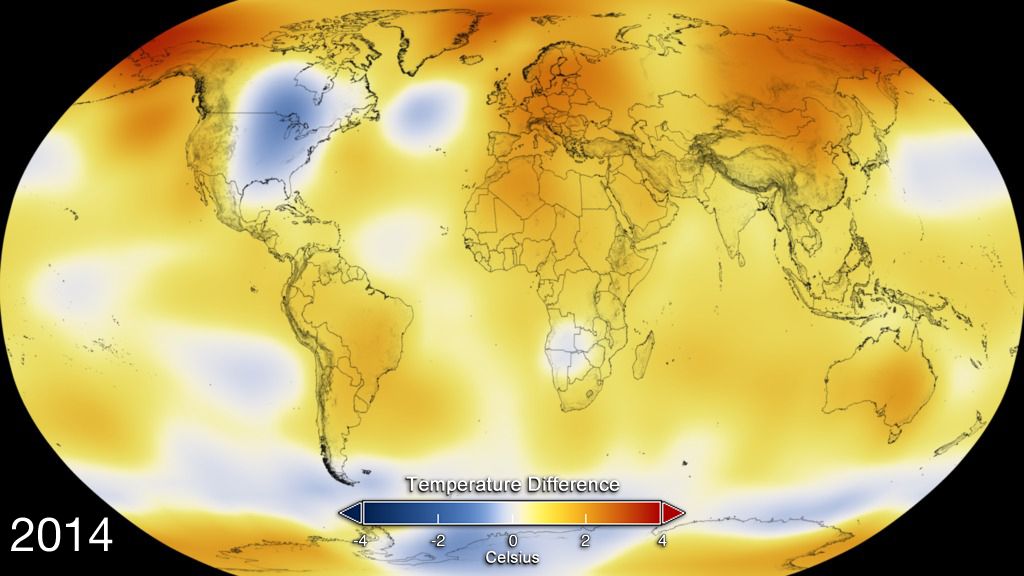
Hottest year ever....what does that even mean?.... warmers like to point at graphs like this and claim that man is responsible for warming the planet.
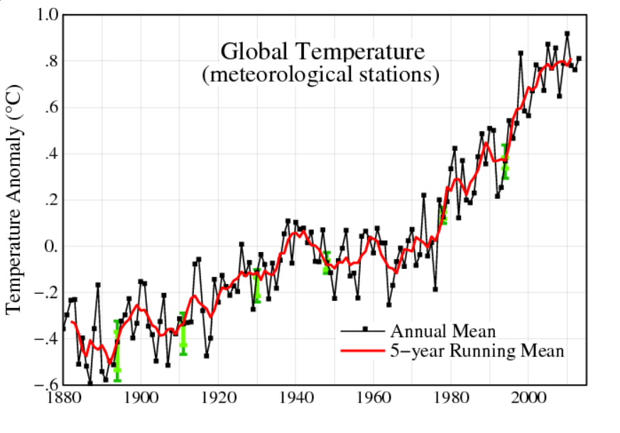
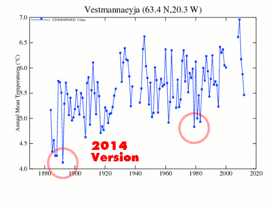
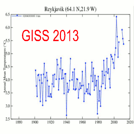
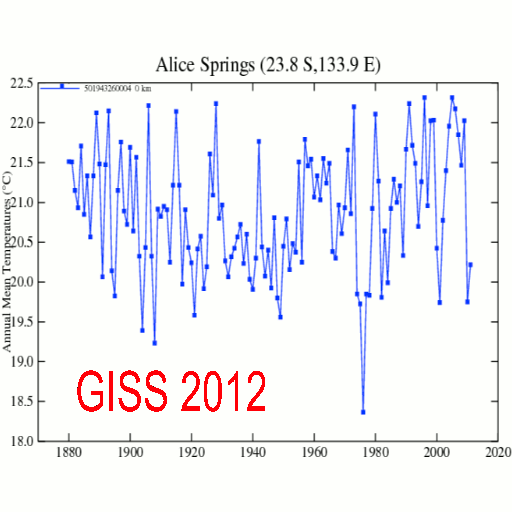
In so far as it goes, I suppose it shows something. First, it shows that climate science is willing to tamper with data to promote the idea that man is causing the climate to warm. Second, it shows that by picking a particular period of time, you can convince people who lack context that man and is fossil fuel burning is warming the globe.
I mean, if my context were limited to that graph, and I weren't inclined, for reasons of either laziness, lack of intelligence, or politics to research further, that graph would be pretty damning inso far as pointing a finger at mankind for causing climate change.
I am inclined to look further. In human terms, 1880 may seem like a long time ago and enough time to get a handle on what the climate used to look like and what it looks like today and how man may be responsible for causing it to change. In earth terms, however, the period from the 1800's to today are not even a blip.
What does the graph above look like when compared to a slightly longer period of time. Say the time since the ice fields started melting back some 10,000 to 14,000 years ago? Have a look, and then tell me how scary the graph above is, and how much it supports the preposterous idea that a trace gas in the atmosphere is driving the global climate.
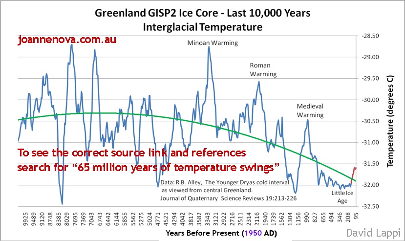
Context is, and always be everything. The idea that because yesterday was cool and today it is warm and therefore today is as warm as it has ever been and tomorrow will be warmer and the next and the next and the next will be progressively warmer till we all die is just stupid. The fact is that the past year was not the warmest year ever...the fact is that it was among the 3% of coldest years since the glaciers started melting back.
Want more context?...grab yourself a graph that goes even further back in time...say back to the time before the present ice age began....about 20 million years or so ago and you will se a world that was so warm that no ice existed at either pole....a world in which atmospheric CO2 was in excess of 1000 ppm...a word that didn't experience run away global warming...a world that was flourishing with life...everywhere....a world where the oceans were not turning acidic even though CO2 levels were far higher than the present.....a world, in short, where it was just business as usual on a planet where the climate is constantly changing with or without our presence.
Hottest year ever....what does that even mean?.... warmers like to point at graphs like this and claim that man is responsible for warming the planet.
In so far as it goes, I suppose it shows something. First, it shows that climate science is willing to tamper with data to promote the idea that man is causing the climate to warm. Second, it shows that by picking a particular period of time, you can convince people who lack context that man and is fossil fuel burning is warming the globe.
I mean, if my context were limited to that graph, and I weren't inclined, for reasons of either laziness, lack of intelligence, or politics to research further, that graph would be pretty damning inso far as pointing a finger at mankind for causing climate change.
I am inclined to look further. In human terms, 1880 may seem like a long time ago and enough time to get a handle on what the climate used to look like and what it looks like today and how man may be responsible for causing it to change. In earth terms, however, the period from the 1800's to today are not even a blip.
What does the graph above look like when compared to a slightly longer period of time. Say the time since the ice fields started melting back some 10,000 to 14,000 years ago? Have a look, and then tell me how scary the graph above is, and how much it supports the preposterous idea that a trace gas in the atmosphere is driving the global climate.
Context is, and always be everything. The idea that because yesterday was cool and today it is warm and therefore today is as warm as it has ever been and tomorrow will be warmer and the next and the next and the next will be progressively warmer till we all die is just stupid. The fact is that the past year was not the warmest year ever...the fact is that it was among the 3% of coldest years since the glaciers started melting back.
Want more context?...grab yourself a graph that goes even further back in time...say back to the time before the present ice age began....about 20 million years or so ago and you will se a world that was so warm that no ice existed at either pole....a world in which atmospheric CO2 was in excess of 1000 ppm...a word that didn't experience run away global warming...a world that was flourishing with life...everywhere....a world where the oceans were not turning acidic even though CO2 levels were far higher than the present.....a world, in short, where it was just business as usual on a planet where the climate is constantly changing with or without our presence.
Last edited: