Bullet to the head of the AGW hoax?

I have no interest in trying to convince you of anything. Whatever you wish to believe is fine with me.

Right. I didn't ask to be convinced of anything. I asked for evidence to support your claim. I accept the imperical evidence that additional CO2 in the atmosphere can not result in man made global warming. The evidence speaks for itself. Clearly, you can not offer any evidence to the contrary. Sorry that you have been duped.

I was merely pointing out that the issue is more complex than merely overlaying two graphs, patting oneself on the back and claiming the problem solved.

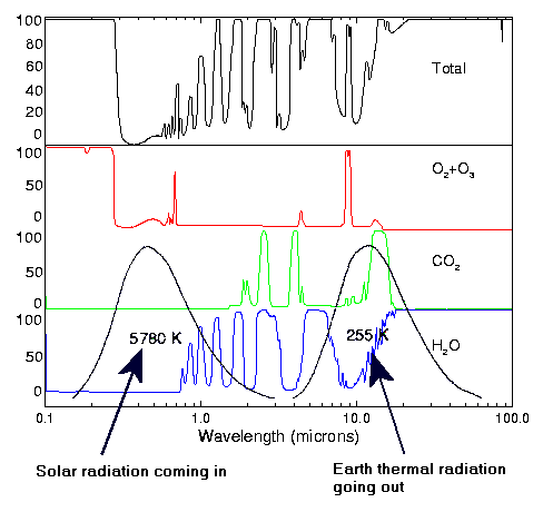
The issue is no more complex than looking at the outgoing long wave radiation in the CO2 spectrum 40 years ago and looking at the same spectra today with the increased atmospheric CO2. If the same amount of longwave radiation is leaving the earth in the CO2 spectrum, then additional CO2 in the atmosphere is not causing warming. It really is no more complex than that. If AGW theory were true, then less longwave radiation in the CO2 spectrum would be escaping the earth. It isn't. AGW theory is busted. Sorry that you have been duped.

But I suppose I should even attempt to disavow you of that notion either. So you go with that. I'm sure it's a big hit at your tea bagger parties.

And yet more impotent ad hominems in lieu of an actual discussion of the facts.
 
Werbung:
Alright people, what's the predominant color (besides white) in the images below:


SOMEBODY have b*lls enough to say it this time...
 
Alright people, what's the predominant color (besides white) in the images below:...

I'd call it blue... kind of a purplish blue.

According to my measurements, it's 54% cyan, 39% magenta. The hexadecimal is #7987fb. And the Pantone swatch is 2726.

Yup... definitely a purplish-blue.
 
I'd call it blue... kind of a purplish blue.

According to my measurements, it's 54% cyan, 39% magenta. The hexadecimal is #7987fb. And the Pantone swatch is 2726.

Yup... definitely a purplish-blue.

Yes, it's the blue. And the degrees of blue signify the levels of OLR (Outgoing Longwave Radiation). Red-shifted areas signify heat retention, blue-shifted areas signify heat loss to space. The charts are 90-day anomaly charts, the three signifying about nine months. That's about all of them that I've posted to my webshots account, however they've been running that way (referenced against a 1979 through 1995 base period) for several years now. That is, we've been radiating more heat loss to space for quite awhile. Somewhere, I've even got a decadal version of basically the same chart with different colors and it's the same story. This is essentially collated information coming from a satellite that we put into space for the very reason of figuring this out.
 
It means purply-blue is a pretty color to use on maps?

It means that the increased CO2 in the atmosphere is not retarding outgoing longwave radiation; ergo, anthropogenic global warming is not only not happening, the earth is cooling. If you look at the maps, you will see that the brown areas are near the equator where the humidity is higher and if you were to examine a study of which spectra in particular the outgoing radiation was being trapped, you would find that water vapor is responsible for the heat retention. Not CO2.

AGW is, and always has been a hoax. Sorry you were duped. The question is, what do you do now?
 
It means that the increased CO2 in the atmosphere is not retarding outgoing longwave radiation; ergo, anthropogenic global warming is not only not happening, the earth is cooling.

So perhaps if the map were in red instead of purply-blue, then maybe all of the scientists who disagree with you would change their minds?
 
The most reactive greenhouse gas in the atmosphere is water vapor. It is also the most variable and hardest to predict. It can act to both warm and cool the earth, depending on its phase (solid, liquid, vapor) and its altitude. Guess what, climate models cannot directly resolve any of this, which means the most important climate forcing function in the atmosphere has to be parameterized. Good luck with that. I don't know if we're causing the planet to warm, but I personally feel man's inhumanity against man is still the greatest threat we face.

image001.gif
 
So perhaps if the map were in red instead of purply-blue, then maybe all of the scientists who disagree with you would change their minds?

So sayeth the acolyte of the congregation. And the scientists who disagree with me are few and far between. Physicists, chemists, etc. Climate "science" has proven itself to be a pseudoscience of the same order as eugenics, etc.
 
Werbung:
Back
Top