Among climate deniers there seems to be a serious deficiency in the ability to avoid cherry-picking data.
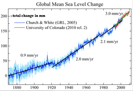
Look at the straight edge on the data between 1880 and 1920. Notice the slope of the data.
Next look at the straight edge on the data from 1920 to 1990 to 1990. Notice a further increase in slope. Finally look at the red straight edge from 1910 to present. Notice a further increase in slope.
That's what physicists call an
accelerated pace. Your graph only shows the data from 1992 to present - the "red" slope at the end.
Furthermore, the caption of your picture "
over the past two years, sea levels have not increased at all" was quoted in the Guardian in
2008. The graph goes on to show Bjorn was totally wrong in the long term
(see the circled area in your graph that he was referring to.) Palerider, don't you realize that the whole idea of your graph was really a joke against deniers like you? Two years? The joke is that Bjorn seemed to think that two years was a sufficient for predicting the future.
Finally look at the man in your picture wiping his eyes in disgust at the stupid remark made by Bjorn. Your graph was joke poking fun at deniers, and you didn't get it, but tried to use it to prove your point!!! That was a total fail on your part!!!